
From Feature Soup to Auto Replies

Making look-alike automation features easy to tell apart
A feature re-org for String.ai

My role
- Role
- Founding Product Designer · String
- Duration
- Approximately 3 weeks, within a three-year product design role
- Status
- Shipped web, iOS and Android. Used by thousands of customers.
As String’s founding product designer, I designed the product from the ground up, working directly with the CEO and engineers. For this effort, I owned the research and design that brought three related automations together under Auto Replies. The redesign launched and became a core part of the product, but the company closed before I could complete the planned impact evaluation.
Overview
String is a text messaging tool for professionals that send a high volume of messages. Think of it like an email client for text messages.
As our product became more mature, it started to feel like feature soup. This meant that our customers were having a hard time distinguishing one feature from another and remembering what did what.
This case study outlines how I identified this problem, explored potential solutions, implemented changes, and tracked their impact.
Context: Users, product, and pains
Our customers ran their businesses from their phones. Every unanswered text could be a lost client, so the stakes of a messy inbox were high. Here’s who they were, what they struggled with, and how String helped.
Context
Our users
The “Pro-sumer” (professional consumer).
- Generally running their own business, and has deep, personal relationships with their clients.
- Individuals who are in charge of their own “Stack” - they choose what technology to use, and are usually very discerning with the tools they implement.
- Text messaging is a large part of their business
- Often texting from their personal phone so they can always be within reach
- Mostly iPhone users
Think Real estate agents, hair stylists, physical therapists, life coaches
Context
Their pain points
Our users provide their clients accessibility by communicating via SMS, but current messaging services leave users in fear that they are drowning in messages and about to drop the ball on important relationships.
01
Drawing the line between personal and professional conversations.
In most cases, our users had both personal and professional conversations on the same number, meaning that when their phone buzzed they never knew if it was their spouse or a business partner.
If someone DID divide professional and personal, it generally meant that they had two devices which is cumbersome.
02
Managing a large number of SMS conversations in the default messengers.
iMessage and Google Chat offer no organizational methods.
Once someone gets behind in replying to messages, it’s very hard to get back to inbox 0. Many of our users had hundreds of unread messages in their inbox.
03
Fearing that they’ll drop the ball
With the chaos going on in their inbox, they were fearful that they were dropping the ball with clients, and letting valuable relationships sour.
Consumers are most easily reached by text message, but as a service provider, it’s very hard to manage all those individual SMS conversations.
How we solve for those pain points
When a user signs up for String, they first choose a new number, this becomes their new work number. Messages and calls to and from that number are managed in our app, leaving their personal phone number to be just that - personal.
Then on top of that base we built a host of features, built with the intention of making it easier to initiate high volumes of conversations, organize those conversations to fit any workflow, and step away from the phone with confidence that you’re not dropping the ball.
The best analog for the String product is an email client for text messages. Below is a list of some of our features, with their closest email parallel.
| Email Client | SMS (with String) |
|---|---|
| Multiple inboxes | Unlimited phone numbers |
| “All Inboxes” View | “Unified Inbox” view |
| Organize emails | Lists |
| Organize contacts | Tags |
| BCC multiple recipients | Mass Message |
| OOO responder | Away Message |
| Canned Responses | Templates |
Plus more organization and automation features
- List view - view your messages laid out like a Trello board
- Keyword responses - Automated responses to specific inbound texts
- Mark unread - easily flag messages to come back to
- Unlimited calling and voicemail
A few of our “Boosts” explained
Below are our most heavily used features explained in more detail. Our users implement them in order to automate some of their responses.
Away Messages
Missed Call Responses
Keyword Responses
Confused?
You’re not alone.
And herein lies the problem. These features are hard to differentiate, especially to new users.
Feedback loops
Without dedicated time or money to conduct formal user research studies, I searched for other ways to get information directly from our users. I created a process I dubbed as “passive research.” I took over customer-facing activities that were already happening from on-boarding calls to help center emails.
Onboarding calls
We were at a stage in our growth where we onboarded every customer we let into the product - Superhuman style. It allowed us to gate who was accessing the product, build a wait list, and most importantly - our data showed that hand-onboarded customers were 3x less likely to churn in the first 3 months.
I offered to start conducting these calls since I wanted to understand how people thought about our features, and find the most useful mental model to describe each one. In response to customer’s reactions during more than 100 onboards, the way that I described particular features evolved as I found what resonated with the most people.
100+ customer calls deepened my understanding of how our users understood our features.
Customer service email
I also took over the role of first responder to customer service emails, allowing me to see first hand the issues that customers were writing to us about.
Admittedly, most of the emails were concerning bugs, but there were also some very illuminating messages that exposed the difficulty our users had grokking our features. I’ll get deeper into exactly what these issues were in the next section.
The problem (one of them at least)
As I have alluded to above, I found that our users had a hard time understanding the differences between some of our features. First time users especially had a hard time understanding what actions would trigger which Boosts. The comments I gathered from users fell into three main buckets:
- Too many features - intimidating
- Many features seemed to have similar function which made it hard to keep them straight
- Their names are slightly obscure.
I would hear things like this from customers…
I set an away message, but when someone calls, they’re not getting it.
- “away message”Triggered by text message
- “calls”This would be a Missed Call Response
This keyword sent when my away mode wasn’t on
- “keyword”Keyword Responses are agnostic to away status
There was the most confusion around Away Messages, Missed Call Responses, and Keyword Responses. It was clear that we needed to redesign how we presented these so that our customers could properly understand their function and set them up with confidence.
Exploring potential solutions
Here is my obligatory “UX is messy” process shot.
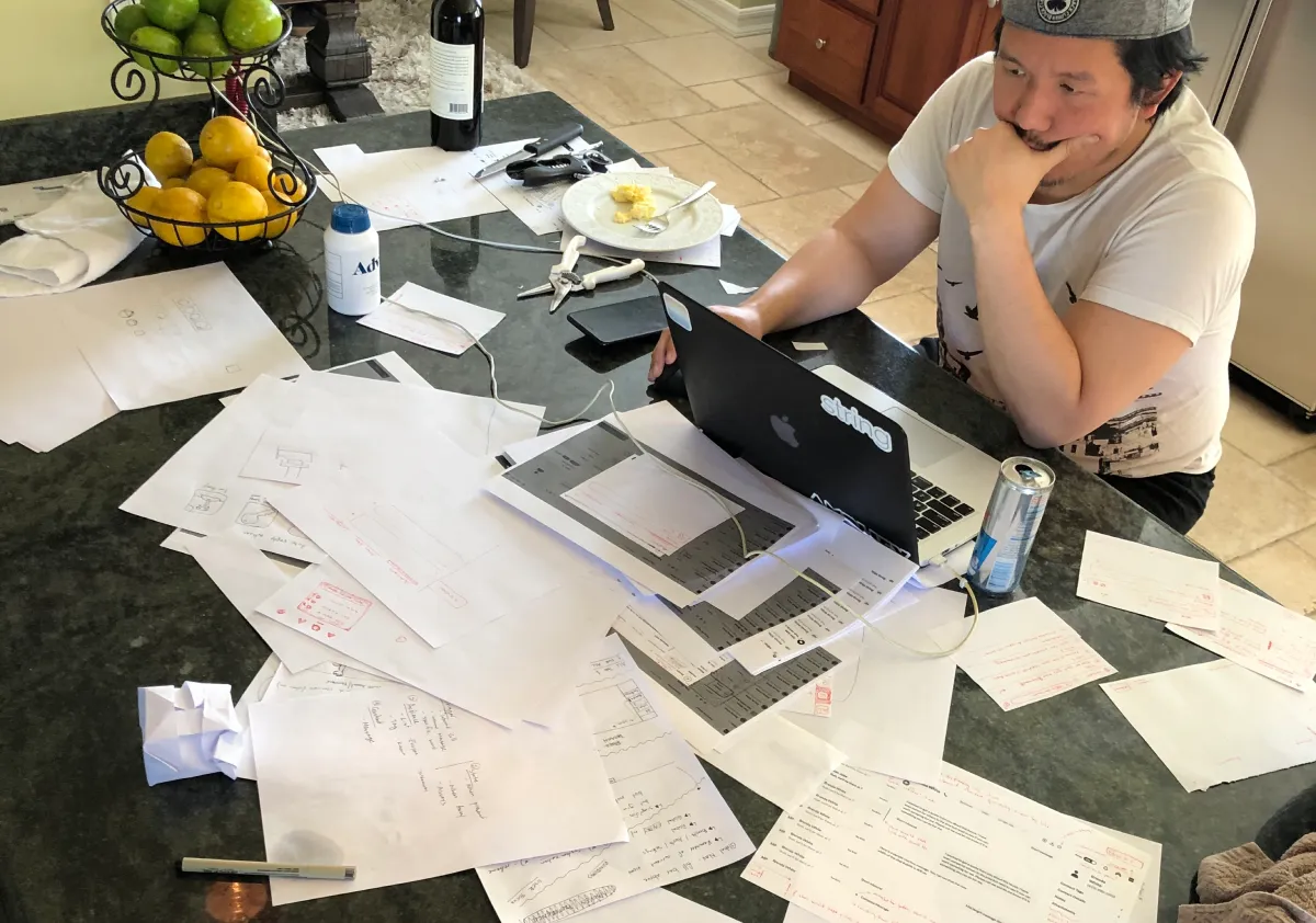
In order to find the right solution, I knew we had to explore a few options. Below are 3 of the many concepts we explored before ultimately deciding on one. (Spoiler alert: it ended up being a bit of a hybrid)
Cut
Hypothesis
By cutting some of these features, we can create simplicity. (This is always the first question I ask when starting a project like this. It helps get to the heart of what is most critical in a product)
Findings
Data in MixPanel showed that users that engaged with boosts had a greater chance of staying 3+ months.
- Templates were the most used, but least sticky
- Missed call responses were the least used, but most sticky.
Conclusion
IFTTT
Hypothesis
By steering away from names, and instead breaking the features into their component parts, creating them will be more intuitive.
Trigger
- Call
- Text
- Specific word
+
Status
- Away
- Not Away
- Always
=
Response
- Text response
Findings
While this did give greater flexibility, it also could result in combinations that we didn’t support and could conflict with other rules.
Focusing on individual components like this is great when you have a wide set of possible inputs to your system. Since we had so few, following a recipe-like structure ended up making the process feel more complex, instead of less.
Conclusion
If we had a more robust set of actions we could take on conversations, this structure would make more sense.
e.g. if someone texts this keyword, respond with this message and add this tag.
Consolidate
Hypothesis
Three of these boosts could be described by saying “String automatically sends a message on your behalf [under certain parameters]”
Let’s group those under the parent “Auto Replies”
Old feature list
- Mass Message
- Templates
- Away Messages
- Missed Call Responses
- Keyword Responses
New feature list
- Mass Message
- Templates
- Auto Responses
- Away Messages
- Missed Call Responses
- Keyword Responses
Findings
Nesting these features simplified the cognitive load of parsing apart all of our features on the first time in. “Auto Responses” was a very intuitive name, so it also gave the user a basis for understanding what the features under it did.
Conclusion
The final answer
Features in context
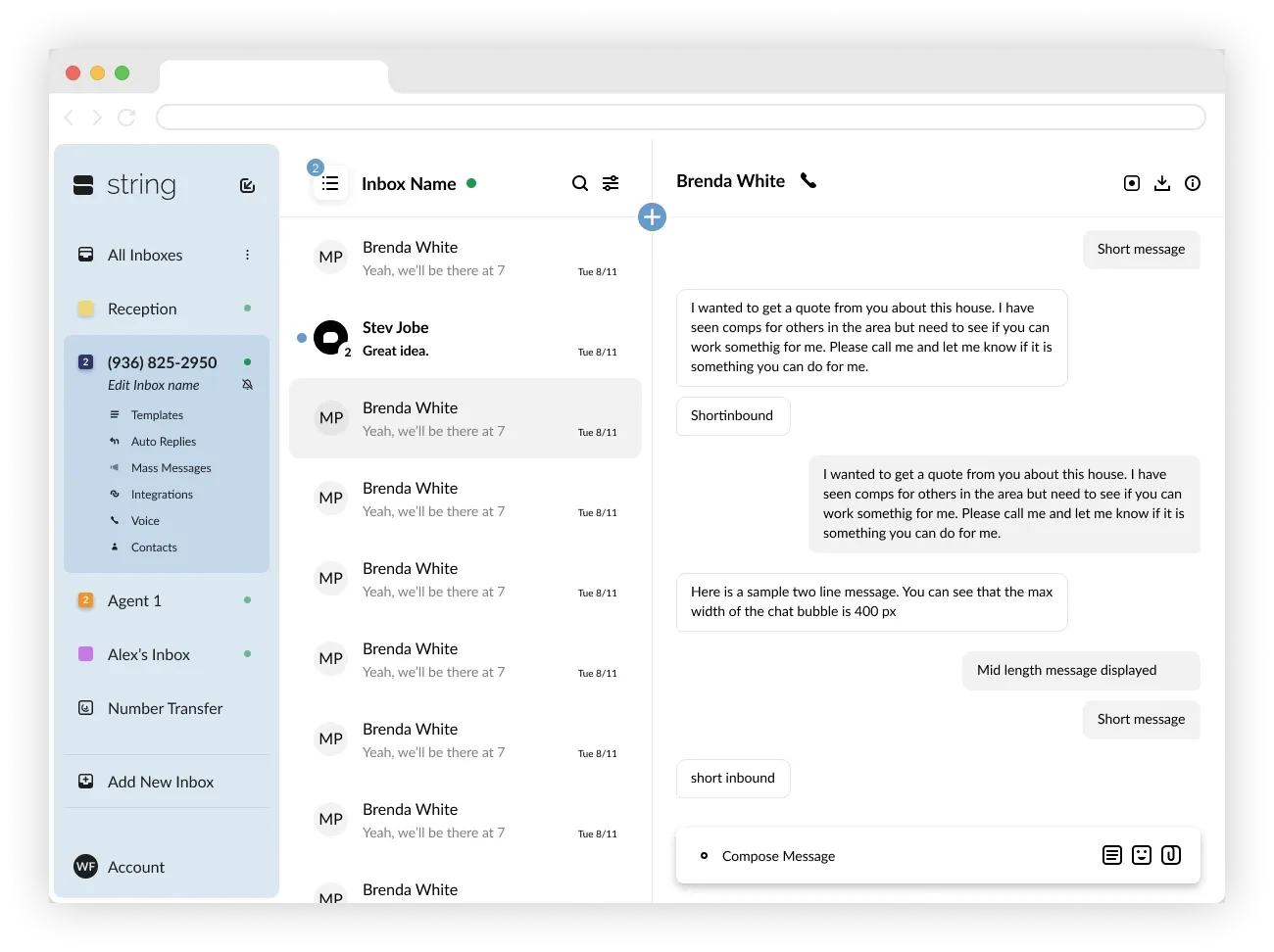
First, here is the home page of the app after a recent visual overhaul. You can see that the “Boosts” live under the inbox header and name on the left of the screen. Shown below are the three states of the left nav.
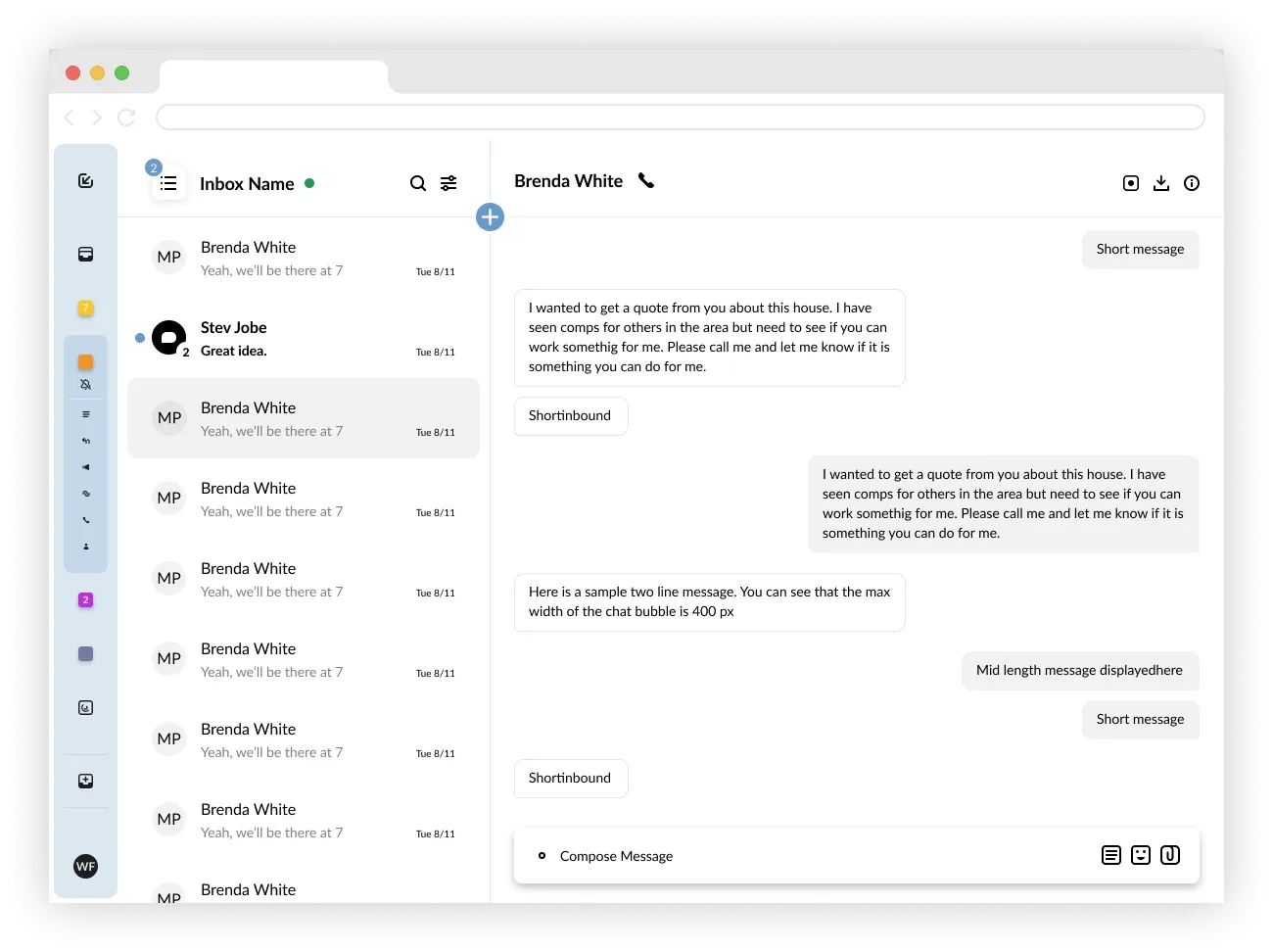
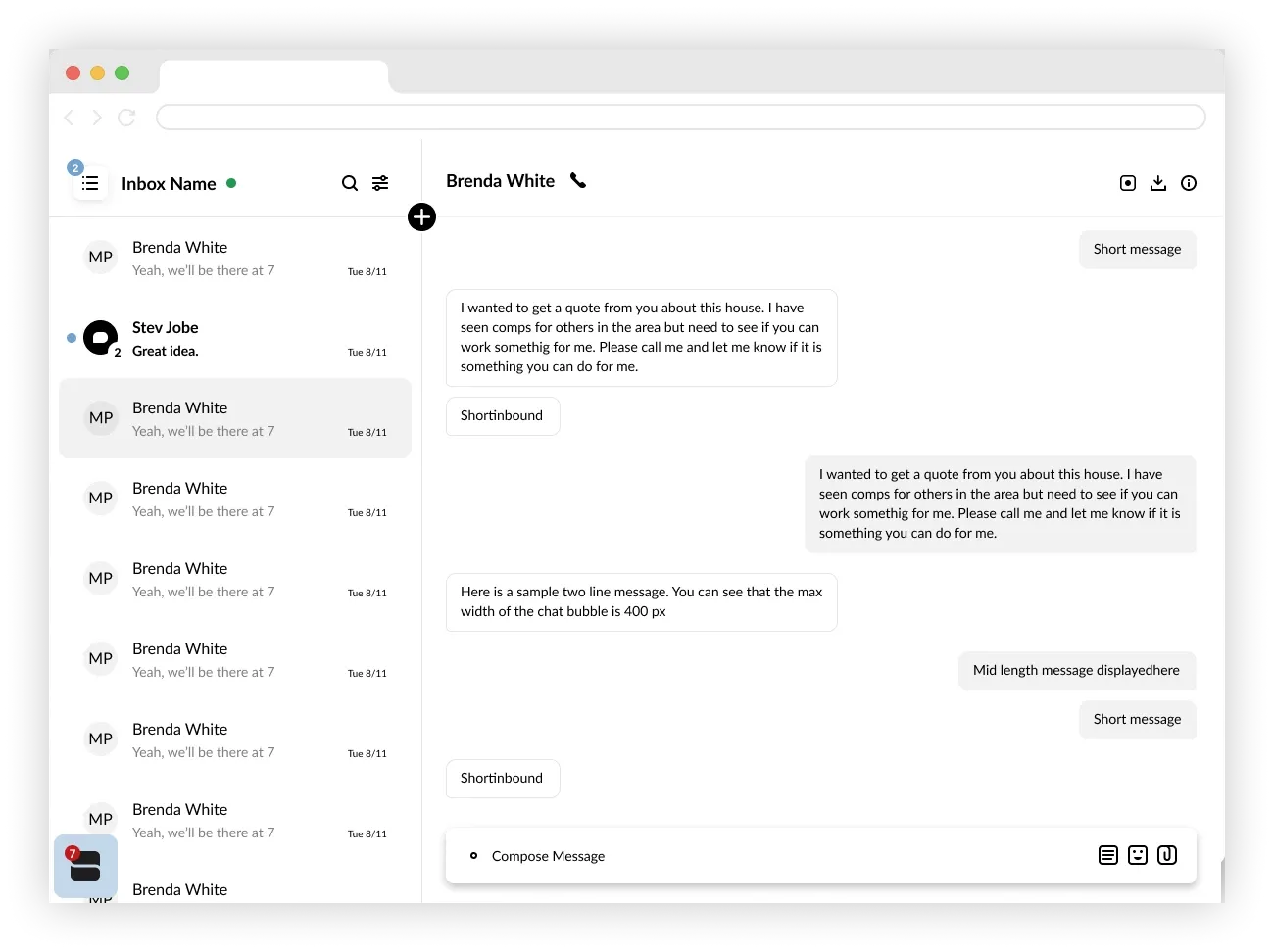
Slide 1 of 3
The final answer
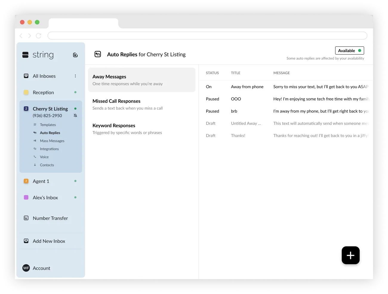
Consolidated features
If a user clicks on “Auto Replies” in the left nav, they are brought to this screen, which now is home to three different flavors of Auto Reply. You can see that in the second column there is permanent space for a description of each feature to help a user choose the right Boost.
The final answer
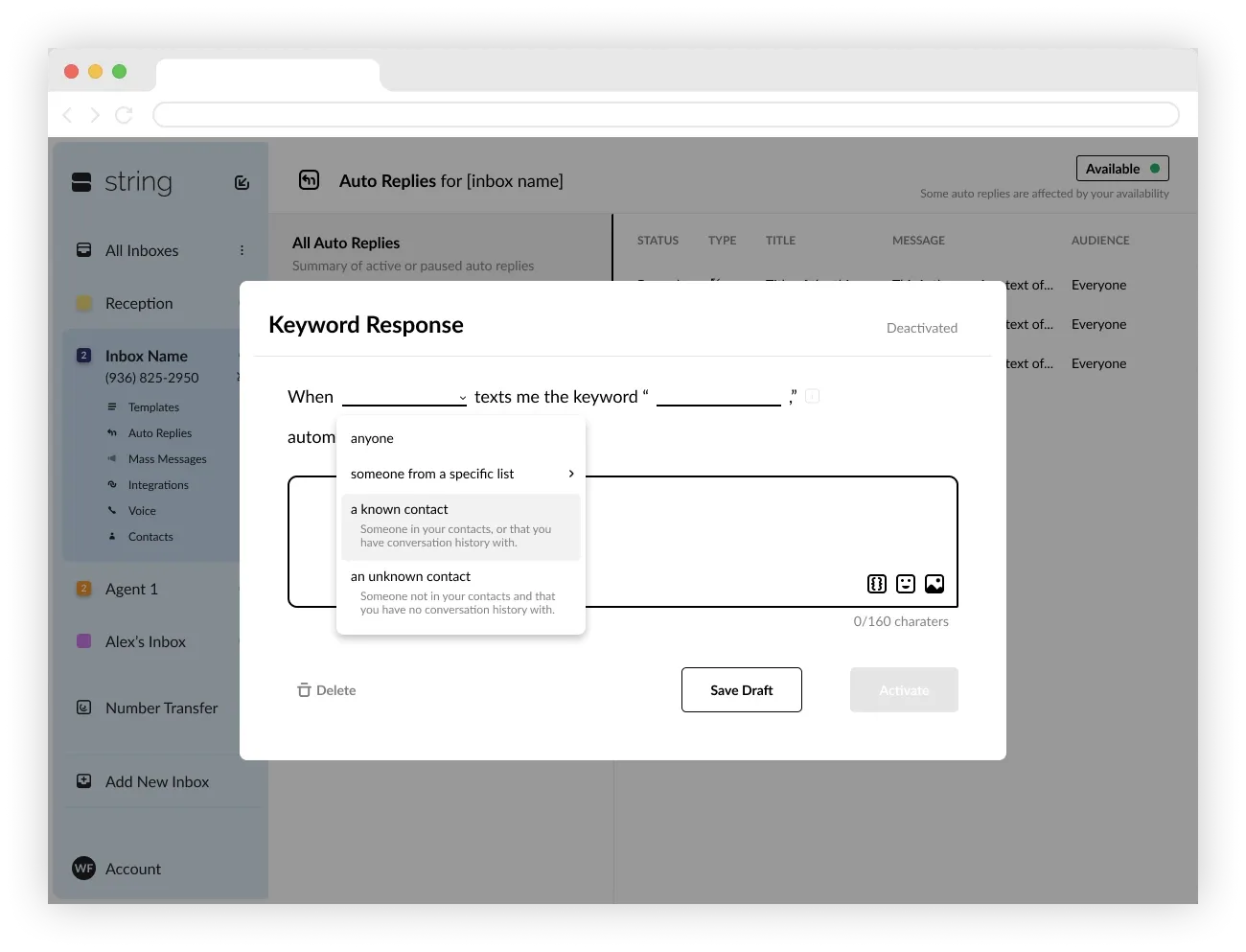
Creating a new auto reply deepens user understanding
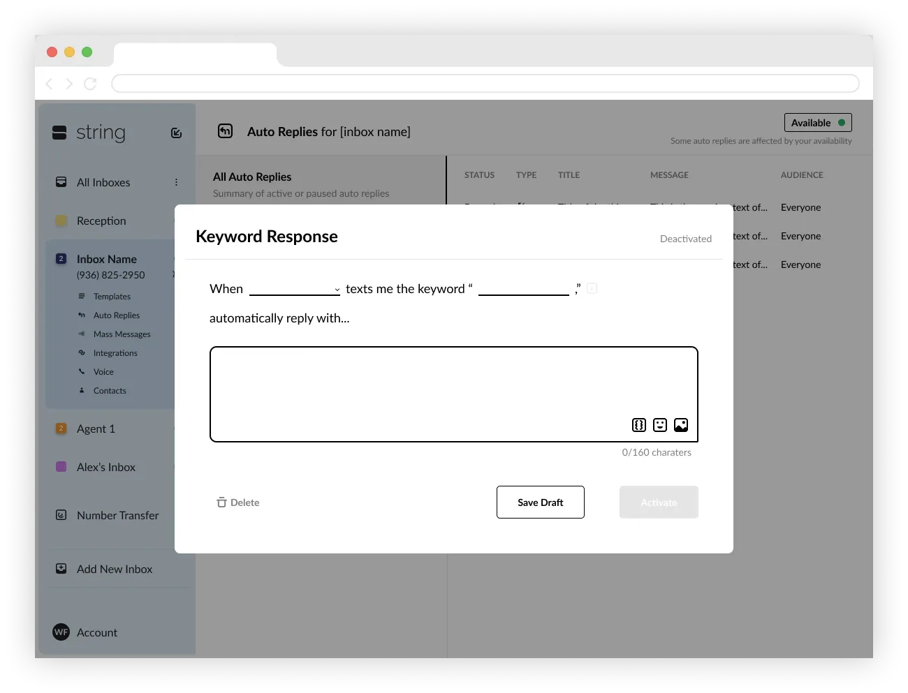
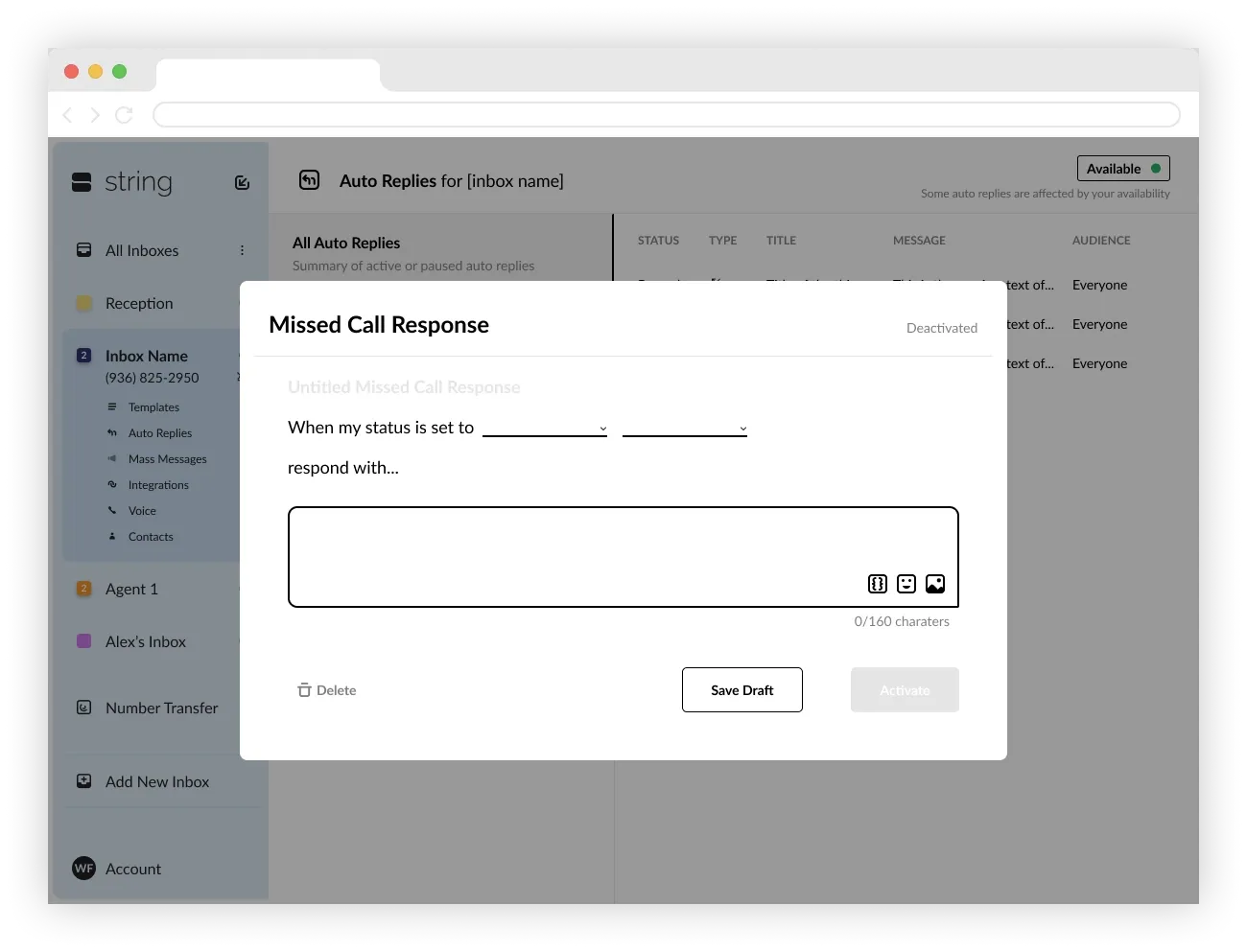
Below are the “Create New” screens for each of the Auto Replies. You can see that we adopted a mad lib style which spells out the function of each feature in plain English with some empty slots for the user to fill out.
Slide 1 of 4
Tracking Improvement
To the great disappointment of myself as well as our hundreds of paying customers, String.ai was forced to close its doors after last-minute funding fell through. Because of that, I wasn’t able to carry out the tracking plan I had devised for the new release of the product.
I had designed a system for tracking the performance of this new layout that included both qualitative and quantitative metrics that went as follows:
Tracking Improvement
Quantitative
Percentage of users creating auto replies
- Has the simpler design led to increased rates of using this feature?
- Does increased use of auto replies continue to increase our retention rate among this group?
Auto reply training and retention rates
I had an A/B test planned, where A would get the standard onboard flow and B would have additional onboarding screens, walking through creating Away Messages, Missed Call Responses, or Keyword Responses.
- Is the B group more likely to put these features to use right away?
- Does use of this feature continue to increase retention in users, even if they’re forced through their first creation?
Tracking Improvement
Qualitative
I also wanted to understand if the new architecture (nesting these features under the title “Auto Reply”) helped users understand exactly what the features did.
Using UserTesting.com I was going to craft a study where I said something along the lines of, “Pretend you are a real estate agent and you have your phone number on a billboard. You have a standard response that you send to all inbound text messages from numbers you don’t know. Can you find a way to automate that process with this tool?” I would then have 1/2 of the users complete the task on the old build, and 1/2 on the new build and compare the time to completion as well as qualitative report on their commentary through the process.
Fin 🎉
If you’ve made it all the way down here, I commend you.
Contact me to talk more.